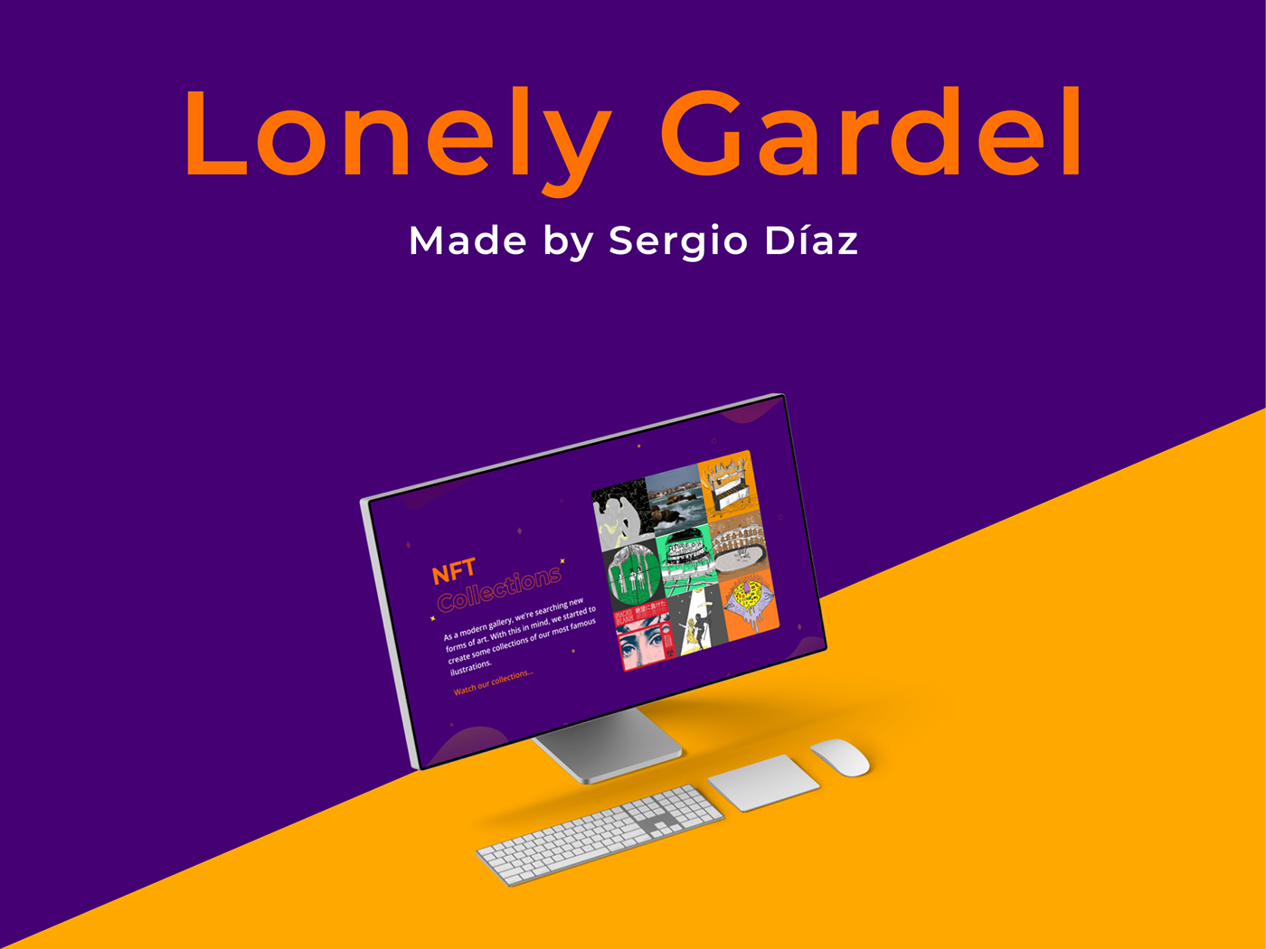
Here you can check the prototype. My recommendation is to navigate in full screen.
Project Idea
For my final degree project, I contacted a friend who studies fine arts at the Universidad Complutense de Madrid, and she told me that she was having trouble making her work known, as she could only manage to publicise it via Instagram or second-hand sales portals. So I agreed to make the designs for a supposed website that she and a colleague of her, could use as a starting point for their working (and above all, in her case, artistic) careers.
Development of the project
So far I had a general idea of how the website would work. But I needed to structure it, so I developed the user flow. I decided to directly create a tab in Figma and as the project was taking shape, I would modify the user flow

Before I started making the black and white wireframes, I looked at competitor's sites to see how they attracted their customers, general art sites and artists that influenced me. These are some of them.


Finally, after looking for influences and researching, I got down to work designing the first black and white wireframes. I decided to start with the Home and go down in the user flow.


Colours and typographies
Once I had created all the important wireframes, I did some user tests to see how the site worked and I started to choose the colours. As it was a modern digital art site, I was looking for colours that were eye-catching and that would capture the user's attention, so I started to try contrasting colours, mixing darker and lighter colours. In the end the colours were white, orange, purple and black.

For the typographies I opted for two that I like how they combine, which are Montserrat and Open Sans. Open Sans was a font I was familiar with and Montserrat has a unique style that gives a lot of charisma to the page.

Final designs
Developed the idea, I started to design the final wireframes. For the Home page, I had originally planned an animation related to the page, but due to lack of time it was not possible. Still, it was replaced by a menu with a small animation, where the user can choose which page he wants to visit.
The general menu also has a transition animation from one page to another, and each of the sections has a different background. The artists have a personal space where they can show their work and each one of them has a different style. Also, being a website, it is important to take into account the responsive design of it, so while designing the website for desktop devices, I also made the responsive version.


